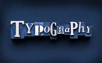
No matter where you look, words are everywhere. From a McDonald’s billboard and a street sign to a magazine cover and a website. It’s easy to overlook typography, especially when it flows so seamlessly with the overall design of a piece. However, when typography is wrong, you know it, graphic designer or not.
However, when typography is wrong, you know it, graphic designer or not.

The right typographic design can make or break a message, and even a brand. When designing, there are several guidelines you should adhere to if you want to create a strong, clear, consistent message that resonates with your audience.
But before we get into the nitty-gritty, let’s get one thing straight: A typeface is not a font, just like an alligator isn’t a crocodile, and “affect” doesn’t mean the same as “effect.” The two terms are not interchangeable. A font is the collection of characters and the method you use to deliver a message; the typeface is the overall look of the characters; in other words, the creative piece.
If you aren’t too confused yet, keep reading. We’ve outlined the Top 12 Typography Mistakes and how to avoid them, courtesy of ROI Online’s talented graphic designers, Gabe and Lauren.
1. Distorting Fonts
Never, under ANY circumstances, distort your font. Just because you can stretch or squeeze a font, doesn't mean you should. If you are short on space, just be mindful when adjusting the kerning (letter spacing) or leading (spacing between lines).
2. Font Families
Use typefaces that have multiple styles and weights in the same family (bold, semi-bold, italics, etc.) to get more variation out of the same font. Canva has an excellent glossary of typographic terms to help you better understand the often confusing "font language."
3. Font Limit
Don't use more than two to three fonts on a single project. Otherwise, the piece will become too busy.
4. Death to Comic Sans
Comic Sans and Papyrus are not attractive typefaces. PLEASE don't use them. EVER.
5. Mixing Fonts
When mixing fonts, use fonts that are not too similar to one another. You want typefaces that contrast nicely. For example, Century Gothic and Rockwell complement each other well.
6. End Message
Think about your end message when choosing fonts. Traditional messages may look better in an older, more classic serif font.
7. Be Consistent
Don't mix too many fonts across a single brand. For example, a single website should pick a font palette and stick to it. Don't throw random fonts on random site pages.
8. Keep Designs Fresh
Don't get too comfortable with a single font. Although you may love Open Sans, refrain from using it on everything.

9. Readability
Readability is crucial to getting your design’s message across. Just because something looks cool doesn’t make it practical. Body copy must be easy to read. Stay away from display, script, grunge, or monospace fonts for body copy. (All of these are great options for header fonts, however.) The end-user is the one who will read your message; therefore, they should be able to read it clearly!
10. Ask for Help
If you find yourself stuck in a typography rut, ask co-workers / fellow designers for help! A new set of eyes can work wonders. Teamwork makes the dream work!
11. Widows and Orphans
Be sure to fix any widows and orphans, which are dangling words or short lines at the bottom or top of a column of text.
12. Licensing
Make sure the font you use has the right licensing. If you don't have rights to it, don't use it! There have been many lawsuits for unlicensed fonts. Don't find yourself in this pickle! Some of our favorite free font sites are Font Squirrel, Dafont, Urban Fonts and Google Fonts (for web).
Typography layout is as important to a design as the pictures and other design elements. Always keep this in mind, whether you are designing a website, a magazine article, a postcard or even a fun quote post for Instagram.
*Additional link for commercial use fonts
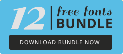
Make sure your font pairings always complement each other by downloading our 12 Free Fonts Bundle!