If you are a graphic designer, you most likely absorbed an entire vocabulary of design terms while attending school. Design terminology is like another language, and sometimes we completely forget that the rest of the world may have no idea what these terms mean.

Therefore, I have laid them all out in their simplest form. All of these terms are extremely important tools to help create great design for your marketing adventures ahead.

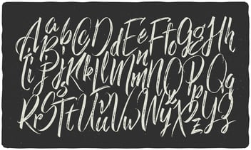
Typography: In the most basic definition, typography is the way you arrange the type in order for it to be most appealing to the viewer.
- You want the typography to have hierarchy (most important text should be largest, secondary text should be mid-sized, and paragraph or supporting text should be smallest).
- Use no more than three typefaces (with some exceptions). Having too many font families on a single piece can confuse the consumer and turn them away from your product.
- Don’t forget to keep your alignment consistent along with your font sizes. It’s a good rule of thumb to have headers, subheaders, and paragraph or supporting text to be the same size across the board. Example: Headers: Century Gothic, Bold, 18pt.
Typeface: Typeface is the entire font family (bold, italic, regular, light, etc.). Always choose a full typeface. This gives you so much more versatility in design because you have a whole array to choose from rather than one single weight or slant.
Font: Font describes the typeface, weight and size used in your design. Typeface and font are not interchangeable. Century Gothic is the typeface, for example, but Century Gothic, regular, 16pt is the font.
Serif and Sans Serif: If you have ever heard a designer mention this term you probably shook your head like you knew what they were talking about, but in reality had NO CLUE. These terms are used to describe what kind of typeface is suggested or in use.  Serif refers to a stroke or foot at the beginning or end of a letter. A few popular serif typefaces are Times New Roman or Minion Pro in the designer world. Traditionally, serif typefaces have been most popular for print materials, while sans serif typefaces have been most likely seen on webpages or in digital media. Sans Serif is a more simple design without (sans) a stroke or foot on the letter. Helvetica is the most popular Sans Serif typeface, but Century Gothic is one of my personal favorites.
Kerning: This refers to the space between letters in a word or sentence. Some typefaces have been made where all of the letters are super close together or extremely far away from one another. Kerning is how you fix this. Instead of having to manipulate each individual letter and hoping that it is spaced evenly, kerning will do it for you.
Where do you find the kerning tool, you ask? I have included an image of where this is located in Adobe Photoshop. Happy Kerning!

Leading: In paragraph text in a document, the leading is taken care of. Is it always right? No. Leading refers to the space between lines of a paragraph.
If your leading is too low, the letters can run into one another on the lines and become very confusing for the consumer to read or understand. If they are too high, the paragraph can seem a bit disconnected and hard to read. How can you change leading? See the image below to find out where the leading tool is located in PhotoShop and how to change the leading.

I hope this clears up any typography confusion you may have had. Now go show off your newfound lingo!